Renovating a home can be an exciting and fulfilling experience that improves your living space’s function and aesthetic. As Australia’s housing market continues to evolve, staying competitive and creating a home you truly love is essential. This comprehensive guide’ll discuss critical factors, trending paint colours, and some practical tips to help you achieve the best results on your renovation journey.
Factors to Consider in Paint Colour Selection
When it comes to choosing paint colours for your home renovation project, several factors must be taken into account. These include your preferences, budget constraints, and various considerations for each room. Remember that certain colours may evoke different emotions, and your choices should reflect the atmosphere you want to create throughout your home.
Consider the following aspects when determining your paint colour choices:
- The primary use of the room: Workspaces, for example, should have colours that inspire productivity, while bedrooms should create a sense of relaxation.
- The room’s size and shape: Light colours will make a room appear more spacious, while darker colours will have the opposite effect.
- The room’s lighting: Natural light will affect how a colour appears in a room, so consider this when selecting hues.
- Your personal choice and style: Despite trends and guidelines, your preference is the most critical factor. Make sure your choices represent your individuality.
- Budget constraints: Depending on your budget, you may need to explore cost-effective alternatives. This may involve considering cheaper paint brands or compromising on specific colours.
Understanding Colour Psychology
Colour psychology is the study of how different colours can impact an individual’s mood, thoughts, and behaviours. By leveraging this knowledge, we can create spaces that evoke the desired emotions and atmosphere.
Here are some common colours used in interior design and the feelings they are typically associated with:
- Red: Excitement, energy, and passion.
- Blue: Calmness, tranquillity, and stability.
- Green: Restfulness, growth, and balance.
- Yellow: Happiness, warmth, and positivity.
- Orange: Energy, creativity, and warmth.
- Purple: Luxury, mystery, and sophistication.
- Grey: Elegance, practicality, and neutrality.
Popular Paint Colour Trends
Staying up to date with contemporary paint colour trends can help breathe new life into your home and ensure its competitive edge. These trends, however, aren’t a one-size-fits-all solution. It’s essential to consider your budget and personal preferences in addition to what is fashionable.
Here are some trendy paint colour options for various budgets and preferences:
- Minimalist Neutral Tones: Earthy shades, such as beige, taupe, and greige, are on-trend and can be found in an assortment of affordable paints.
- Deep Green and Blue: These dramatic colours, often used to create a feature wall, can be sourced from both high-end and cost-effective brands.
- Terracotta and Rust: This warm, earthy palette works well as an accent colour and can be found in affordable paint options.
- Monochromatic Palette: An ageless trend that caters to all budgets, monochromatic palettes consist of various shades of one colour running throughout a room.
Essential Tips for Choosing Paint Colours
When selecting paint colours, follow these tips to ensure the best outcome:
- Try paint samples: To visualise how colours will look on your walls, test sample pots or swatches under varying lighting conditions.
- Use colour wheels and charts: These tools can help you visualise complementary and contrasting colour schemes.
- Consult a professional: If you’re having trouble making decisions, seek the advice of an interior designer or colour consultant.
- Keep budget in mind: Adapt tips and processes to suit your financial constraints. For example, consider discount or generic paint brands that offer similar colours to premium lines.
Room-by-Room Paint Colour Selection
Here are cost-effective paint colour suggestions for each room in your home:
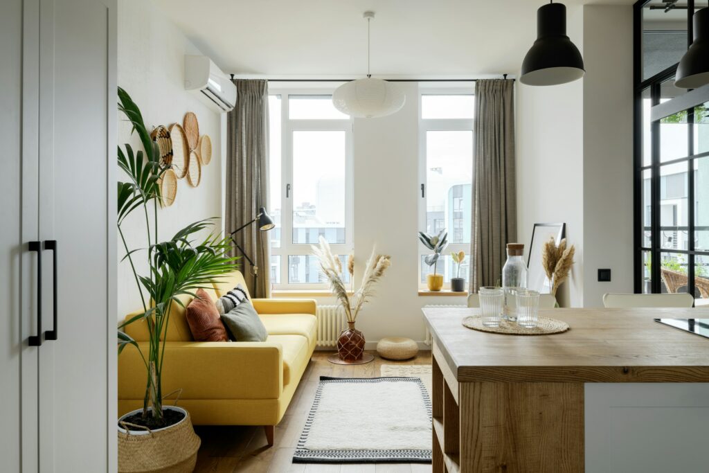
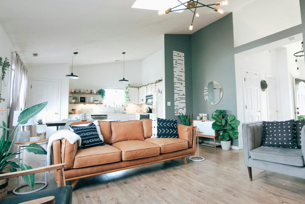
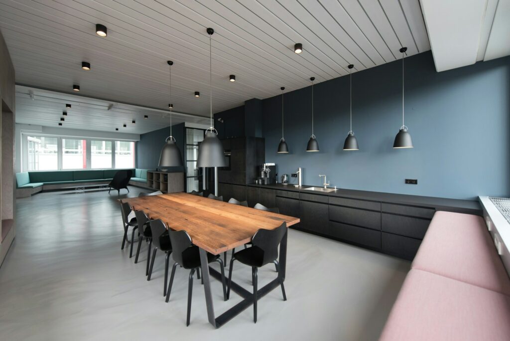
- Living Room: Combine warm neutrals with one statement wall in deep blue or green.
- Kitchen: For a modern and spacious feel, try white with contrasting accents, such as black or stainless steel.
- Bedroom: Use soothing colours, such as light greys, for a tranquil atmosphere.
- Bathroom: A combination of neutral tones and shades of blue creates a clean, inviting space.
- Workspace: Choose a colour that promotes focus and productivity, such as a soft blue or green.
Conclusion
With these insights, you’re well-equipped to tackle your Australian home renovation project. While it’s important to stay on-trend and consider essential factors, don’t forget to explore your individuality and make choices that reflect your personal style—without breaking the bank. Happy renovating!
Q: What is the impact of light on paint colours?
A: The amount of natural and artificial light in a room can significantly impact how colours appear. A shade that looks perfect under one lighting condition can look entirely different under another. It’s essential to test paint swatches on your walls and observe them at different times of day to see how the light affects the chosen colour.
Q: How can I make a small room appear larger using paint colours?
A: Lighter colours, like soft whites, greys, or pastels, tend to make small spaces appear larger by reflecting light and creating an open,airy feel. Conversely, darker shades can make an area feel smaller and cosier; consider this when selecting colours for various rooms in your home.
Q: Can I use bold colours in my home?
A: Absolutely! Your home should reflect your individuality, so don’t be afraid to experiment with bold colours if they make you happy. However, it’s essential to consider how these bold colours could impact the room’s atmosphere and select them accordingly. For instance, a bright red might work well in a kitchen but might not be as suitable for a bedroom meant to promote relaxation.
Q: How do I choose the right colour for a room with limited natural light?
A: For rooms with limited natural light, opt for colours that reflect light and help brighten the space. Light, neutral colours, like soft whites, greys or pastels, are ideal for dark rooms as they create a more open and airy feel. You can also use mirrors or additional lighting to help distribute light throughout the room.
Q: Can I mix different colours in one room?
A: Definitely! Mixing colours in a room can create visual interest and depth. To ensure a harmonious look, pay attention to colour psychology and consider how different colours interact with one another. Also, try to balance bolder colours with more neutral shades in your overall design.
Q: How can I ensure my chosen paint colour complements my existing décor?
A: When selecting a paint colour, consider how it will work in conjunction with your existing furniture, flooring, and other elements in your home. Matching your wall colour to an accent colour in your décor (e.g., artwork, upholstery, or decorative accessories) can help create a cohesive look. Additionally, using a unifying colour palette throughout your home can create a sense of flow and harmony.